Logos
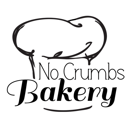
Bakery Logo Design: Created a logo concept for a bakery whose name plays on the idea that the bread is so delicious, there won’t be a single crumb left. The design features a stylized baker’s hat to symbolize craftsmanship and mastery, paired with clean, inviting typography to reflect the warmth and quality of the brand.
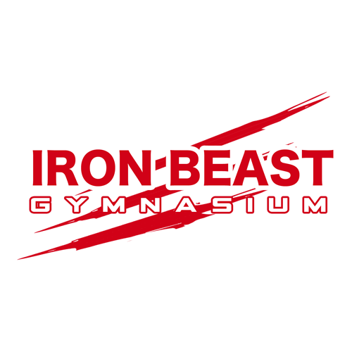
Fitness Logo Design: This logo is inspired by the powerful, primal feeling you get after an intense workout—like unleashing your inner beast. The name reflects that rush of strength and energy, while the claw marks visually reinforce the concept of raw power and transformation. It’s all about capturing the high and confidence that comes from pushing your limits.
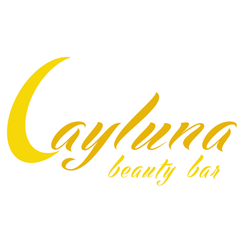
Commissioned Logo Design: This logo was created for a client and named in honor of the owner’s niece. The “L” subtly references the Spanish word for moon (luna), tying the name to a sense of softness and femininity. The rounded typography was carefully chosen to evoke a gentle, elegant feel that resonates with the brand’s target audience.
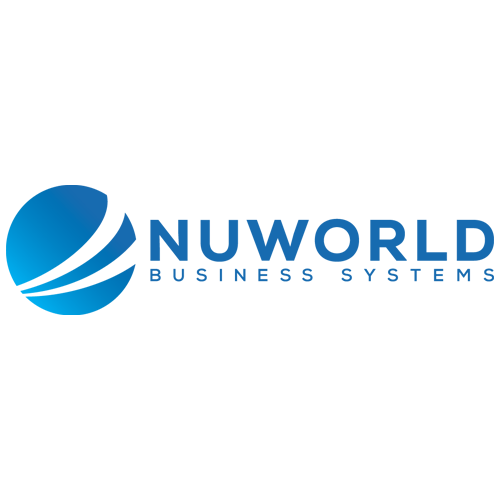
Logo Rebrand Collaboration: Worked closely with the company owner to evolve and refine their original logo concept. Through continuous collaboration and thoughtful design exploration, the final rebrand delivers a strong, confident identity. The solid typography paired with a trusted blue color palette reinforces the brand’s reliability and professional tone.
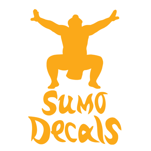
Logo Concept: This design plays on the idea that decals of any size can be created, reflecting the brand’s versatility. The name “Sumo” ties into the concept of size and strength, drawing a direct connection to the powerful and large-scale nature of the products they offer.
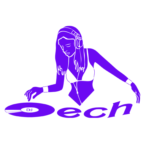
DJ: The goal was to strike a balance between a vibrant party vibe and professional sophistication. Featuring the DJ in a booth emphasizes the energetic, fun side of the brand, while conveying that the ultimate job is to keep the party going. The design captures both the excitement of the event and the professionalism required to deliver a seamless experience.
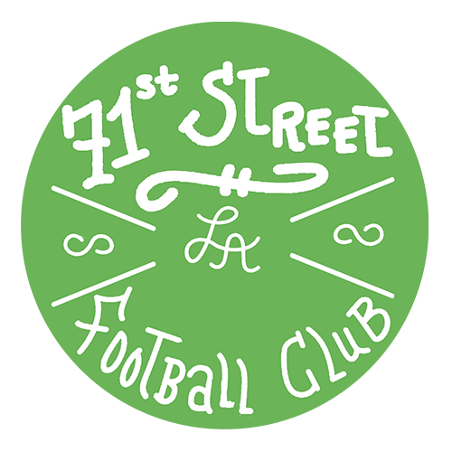
Collaborative Logo Design: This logo was a true collaboration between the client and myself. The client had a strong vision and provided a hand-drawn sample with a style that immediately stood out. I was impressed by the character and authenticity of the sketch, so I refined the layout—adjusting size and placement to establish clear visual hierarchy and enhance the overall message. The client’s handwriting perfectly captured the local, grassroots spirit of the town men’s soccer club we aimed to represent.
Comments are closed.